Hello, well indeed now its much better.
Working as intended now.
Im using latest at the moment 1.1.1 and Chrome 43.
Thank you for your work! Lets just make it better:
Suggestions on the compose message page: 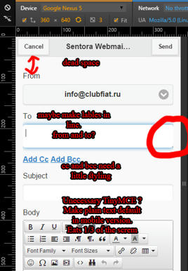
Okay this is first part of the screen, again why is there need to scroll for make an email?
1. Need fit it in one page. Much space is just eaten by padding and margins.
2. Forms when active glow does not fit in the sides, annoying and looks cheap.
3. Labels take much space, form of email is self explanatory, and we have accustomed to it over tons of time. (We can fit them in line or inside of the field with property "placeholder"in the field tag. Since its cellphone version most of them updated regularly so compatability issues would not come up.
4. Add Cc and Bcc is looks outdated. (It has been used by google early version of the mobile site, Thats probably where individual activation was adopted from.)
5. Its without a doubt unecessary to have tinyMCE in mobile version. Lets send text only, and if some person with very small fingers decides to create html masterpiece have option to switch to extended.
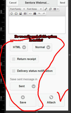
6. Need change html switch to something more mobile. And add only necessary button of Attach.
7. Save option needs to be changed, only offered when person tries to go back or press cancel while words have been written in form.
Suggestion on main page:
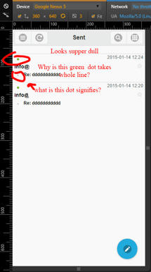
Looks can be improved!
1. Much empty space because of the dot, need improve the way it signifies unread message.
Interesting fact: When open mobile version from desktop still can drag and drop, when open from mobile or browser simulator only can swipe left and right to "read" and delete.
Thought: maybe abandon that feature and make this instead: By clicking on the line make a selection and when selection available offer this options of mark as read, delete selected and move to folder and things.

